What Public Health Interventions Can Teach Us About Building Data Literacy Programs

By Aaron Kalb
Published on April 27, 2020

Whether from watching CNN or FOX News (depending on your politics) or reading Le Monde or The Guardian, citizens worldwide are now ingesting more data in one day than they would normally encounter in a month. The crisis is making everyone—not just data analysts, data scientists, or others with “data” in their job titles—into consumers of data: overall cases, hospitalizations, deaths, state-by-state breakdowns, country-by-country comparisons, and more. And it’s hard to take it all in, to figure out how to interpret the information, and act on it.
While this feels new to many of us, enterprises have been grappling with a similar problem for years. Many enterprises have taken steps to democratize data and invested heavily in the tools and processes for self-service analytics. But making data accessible to more individuals in your organization doesn’t automatically mean they know how to interpret that data properly, nor does it magically turn your company into a “data-driven enterprise.” That requires a data literacy program.
In educating the public about the COVID-19 pandemic, public health officials are effectively taking a page from Jennifer Belissent’s book (or, ahem, report), on the topic. Belissent—a data literacy expert at Forrester—contends that every data literacy program must focus on four goals across three audiences, with the acronym ACES:
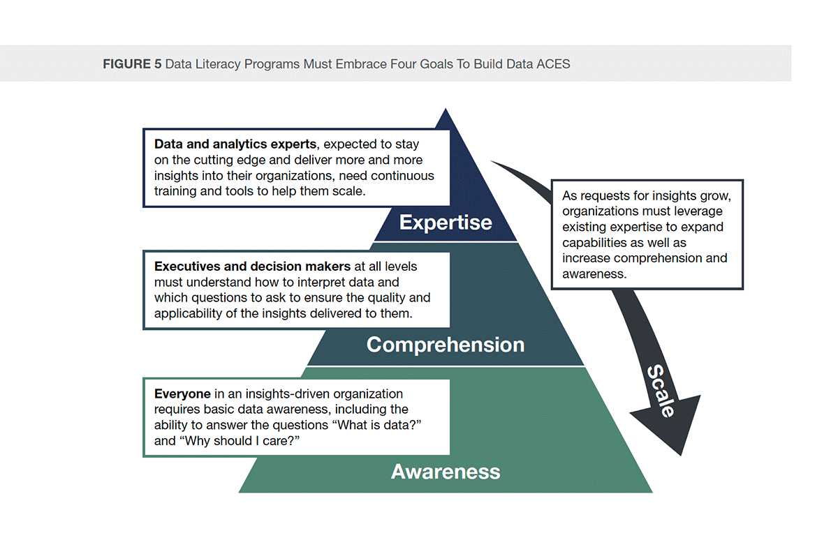
To understand it better, let’s see how the ACES framework maps to the COVID-19 response:
Awareness for Everyone
Belissent argues that “everyone in an insights-driven organization requires basic data awareness, including the ability to answer the questions ‘what is data?’ and ‘why should I care?’.” Similarly, everyone in the world needs to have basic knowledge about COVID-19, enough to care about it, act appropriately, and not be misled by bad data or bad interpretations (e.g., “It’s just the flu!” or “If I’m young, I can just go to Miami Beach on my normal spring break trip.”).
Comprehension for Decision Makers
Executives and decision makers in corporations can act optimally when they comprehend and correctly interpret the data. That’s especially true when responding to a crisis, and also applies for leaders of NGOs or governments. For example, here in the San Francisco Bay Area, business executives made independent decisions about when to close their offices (like our CEO did very early on at Alation) based on understanding what the data was telling them, before the counties and ultimately the state government issued shelter-in-place orders. Later, the office of Governor Andrew Cuomo famously interpreted the data to foresee the need for massive numbers of ventilators to save the lives of New Yorkers.
Expertise for, well, Experts
Data and analytics experts have a key role to play in combating and containing COVID-19, as do domain experts, such as epidemiologists, infectious disease researchers and physicians, and staff at the Centers for Disease Control (CDC) and the World Health Organization (WHO). Which brings us to:
Scale!
Scale is the final goal of a data literacy program: How can the experts influence the executives and decision makers? And how then can the decision makers, who comprehend the data, influence everyone else to “do the right thing”—e.g. stay at home to the extent possible?
Education is a critical component in scaling a message and requires what Belissent calls a “quiver of communication and training arrows”: different channels to reach the intended audience. An organization might have an executive pen a blog, or post a flyer next to the coffee machine, or host a series of “lunch and learns” in different departments or buildings—all efforts to reach out to and educate people in situ.

Now, with offices closed, organizations must rely on other means of communication to reach employees where they are: at home. Meanwhile, public health officials can do the neighborhood equivalents of those in-office approaches, and we’re seeing some of those outreach methods have a tremendous impact. For example, when Dr. Anthony Fauci of the National Institute of Allergy and Infectious Diseases (NIAID) or Governor Cuomo (There he is again! He’s everywhere!) appear on Trevor Noah’s The Daily Show, the message about the seriousness of the coronavirus reaches a different audience than when Dr. Fauci speaks at the lectern in the White House Briefing Room.
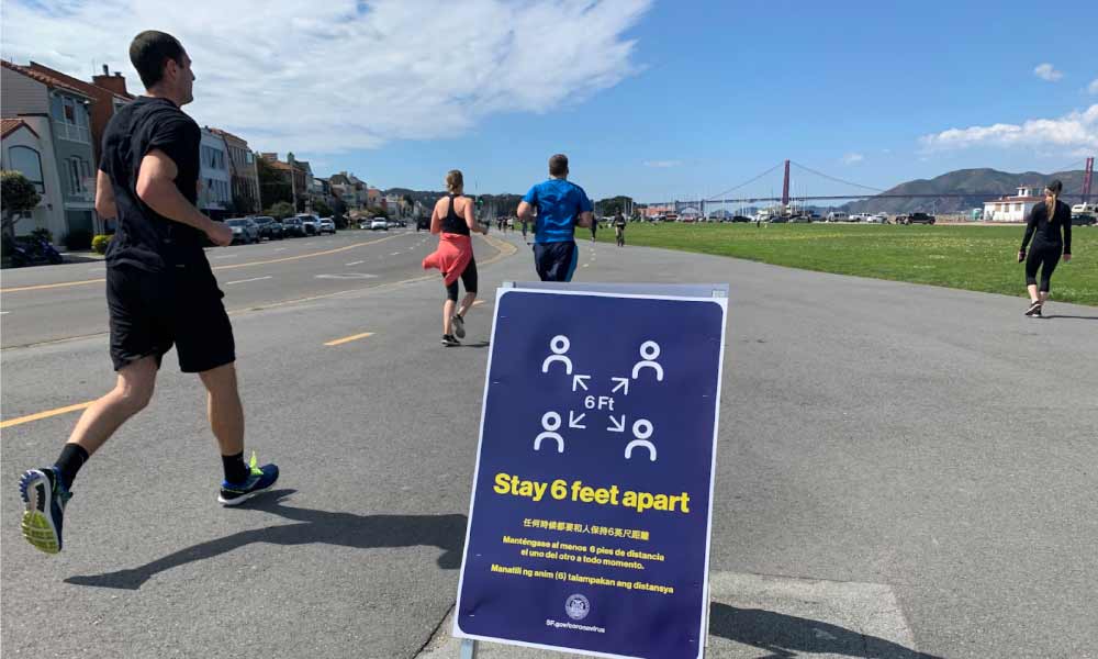
Likewise, the current equivalent of office “water cooler posters” have popped up in public places like parks and trails as well as in grocery stores, pharmacies, and even pet food stores. These graphic reminders of social distancing requirements and the “6-foot-rule” can serve as inspiration for data literacy campaigns.
- Awareness for Everyone
- Comprehension for Decision Makers
- Expertise for, well, Experts
- Scale!
Contents
Tagged with
Loading...